← Back to work

Case 01 — Brand & website · Mission technology

Making a technology partner read like part of the mission.

Client
Blue Vineyard, Oslo
Role
Brand identity & web design
Scope
7 pages · design system
Sector
Mission technology
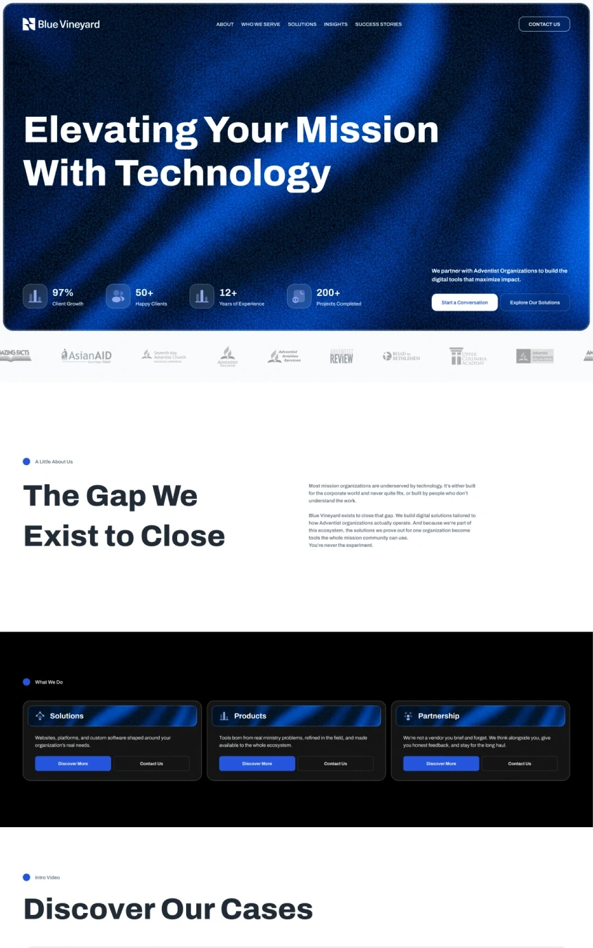
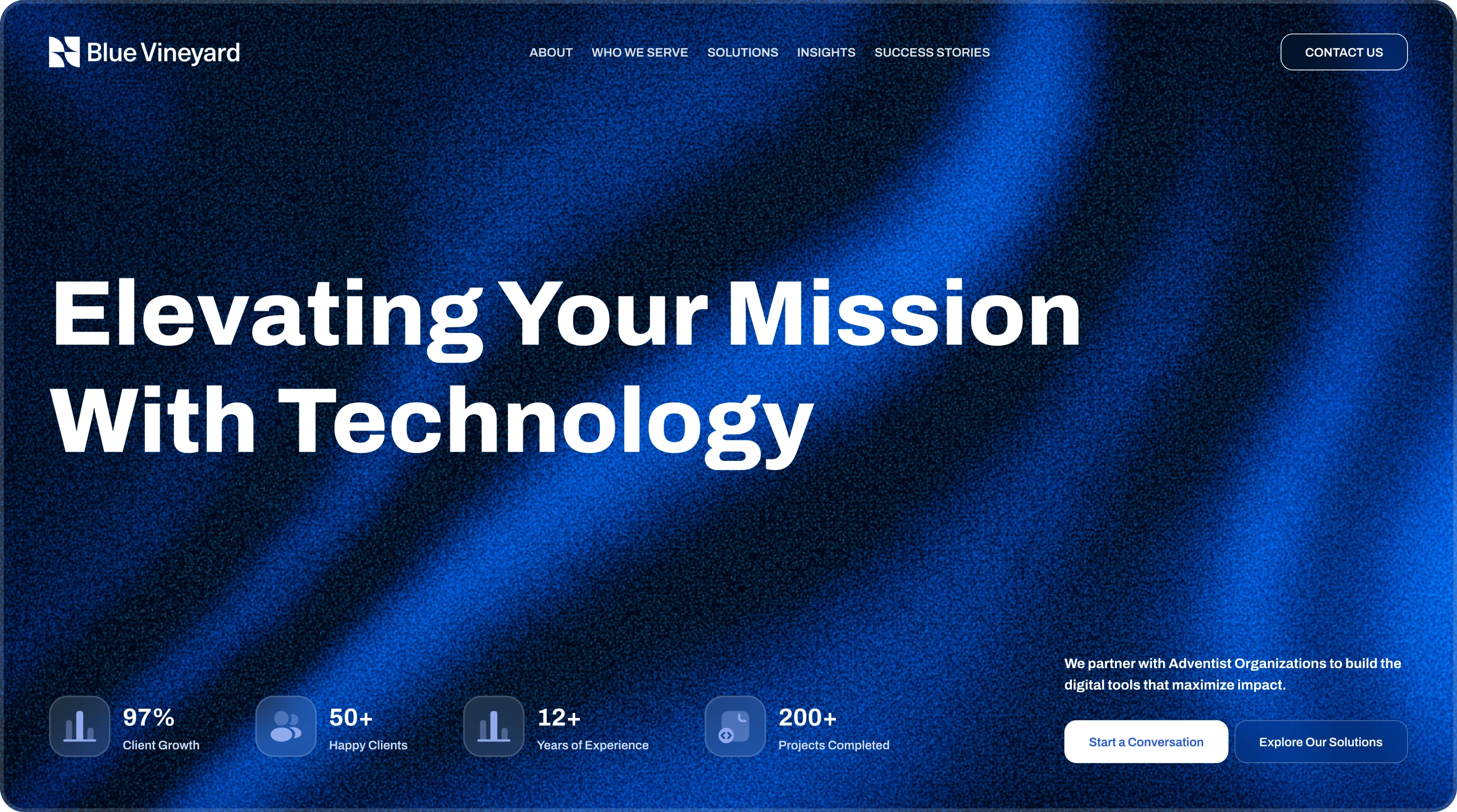
Blue Vineyard home page: “Elevating your mission with technology” over a deep blue gradient, with five figures and two calls to action.
HomeThe whole argument in one scroll: the promise, the proof, and the organisations they already serve.

Context

Blue Vineyard builds websites, platforms and custom software for the global Adventist community — conferences, schools, health ministries, media ministries and nonprofits. The team is spread across North America, Australia, Europe and the Pacific, and grew from seven people to fourteen in a single year.

The work was the front door: an identity and a seven-page website that introduce a young company to an audience that buys on trust, not on feature lists.

Problem

Two audiences, one page.

“Most mission organizations are underserved by technology. It’s either built for the corporate world and never quite fits, or built by people who don’t understand the work.”

Blue Vineyard, in their own words

The site had to answer that from both sides at once: technical enough for the people who ask about platforms, integrations and support, plain enough for the ministry leaders who decide with trust. Lean corporate and the audience feels sold to. Lean soft and the engineering disappears.

Constraints

Working within constraints

Audience
Distributed teams, many of them volunteers
Content
Long-form copy on every page
Assets
Logos and photos from dozens of organisations
Sub-brands
Three products carrying marks of their own
Proof
Trust travels by reference, not by feature list
Surface
Four sectors · three products · seven pages

What I owned

Identity first, then the site it had to live on

  • Brand identity
  • Art direction
  • Information architecture
  • Content structure
  • UI design
  • Design system
  • Page design

The mark, the palette, the type choices, the components and the seven page designs are mine. Photography and partner logos came from the client.

Decisions

Decisions that shaped the site

One promise, repeated in the same shape.

Why
Seven pages, and a visitor can land on any of them — a sector page, a product page, an article.
Result
Every page closes with the same block: the same sentence, the same form, the same button. One path into a conversation instead of seven.
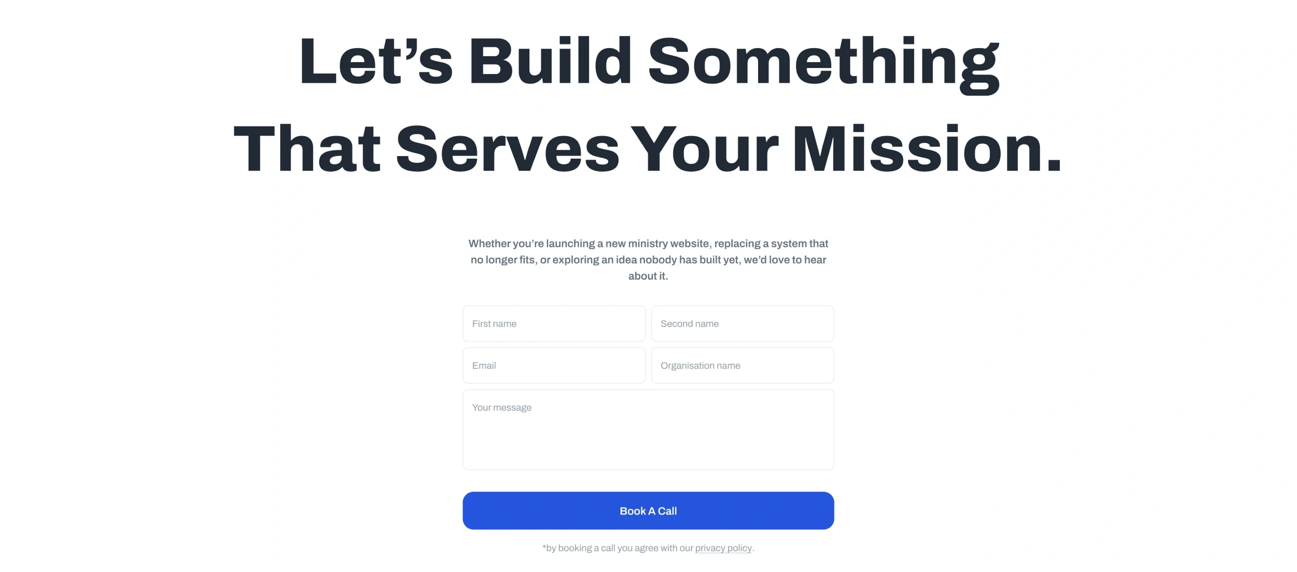
The closing block used on every page: “Let’s build something that serves your mission”, a short form and a Book a call button.

Proof before the pitch.

Why
A young company sells on trust it has not accumulated yet, so the evidence has to arrive before the positioning does.
Result
The hero carries the client’s figures, and the strip of organisations they already serve sits directly under it — logos before adjectives.
A strip of partner logos: Amazing Facts, Asian Aid, the Seventh-day Adventist Church, Adventist Review and others.

Three doors instead of a services list.

Why
They sell three different things: project work, products of their own, and a long-term partnership. A flat list turns all three into “agency”.
Result
Solutions, Products and Partnership stand as three cards on the dark block, each with its own way into the site.
Three dark cards: Solutions, Products and Partnership, each with Discover more and Contact us buttons.

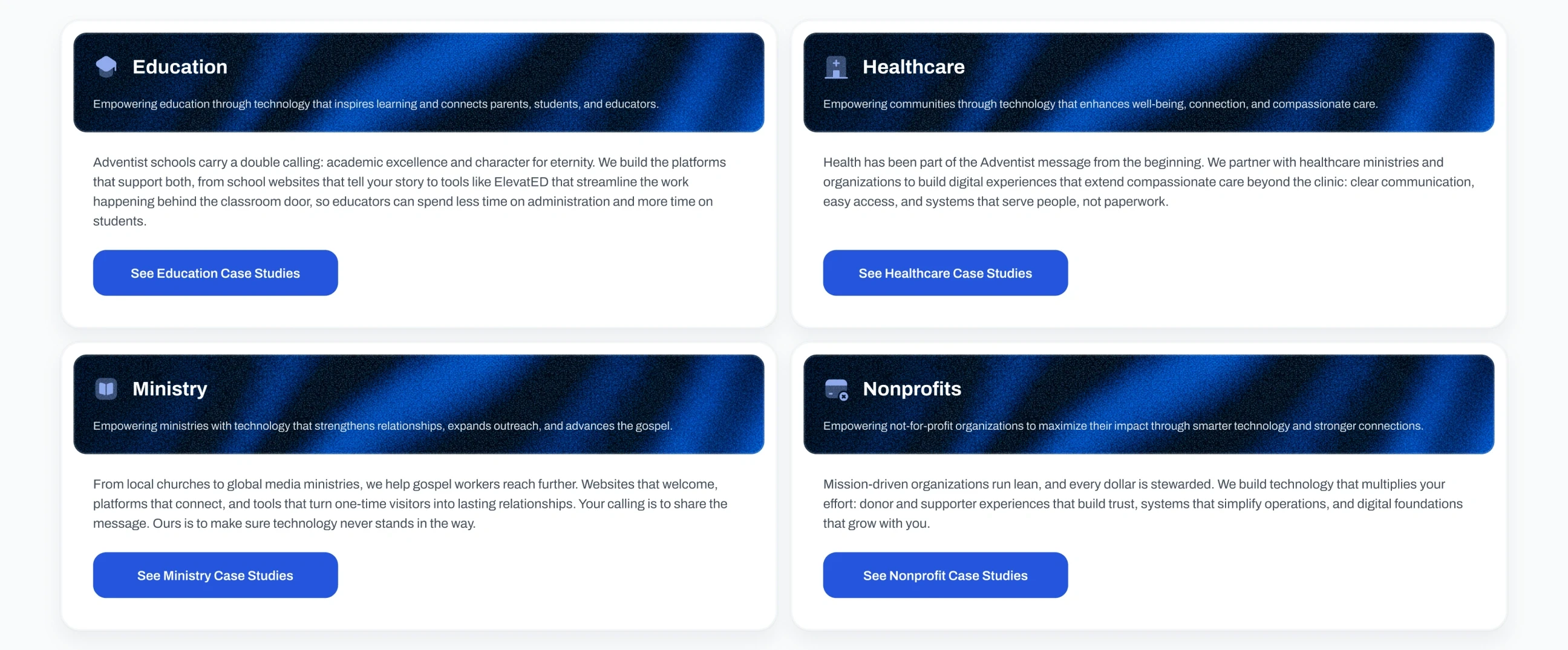
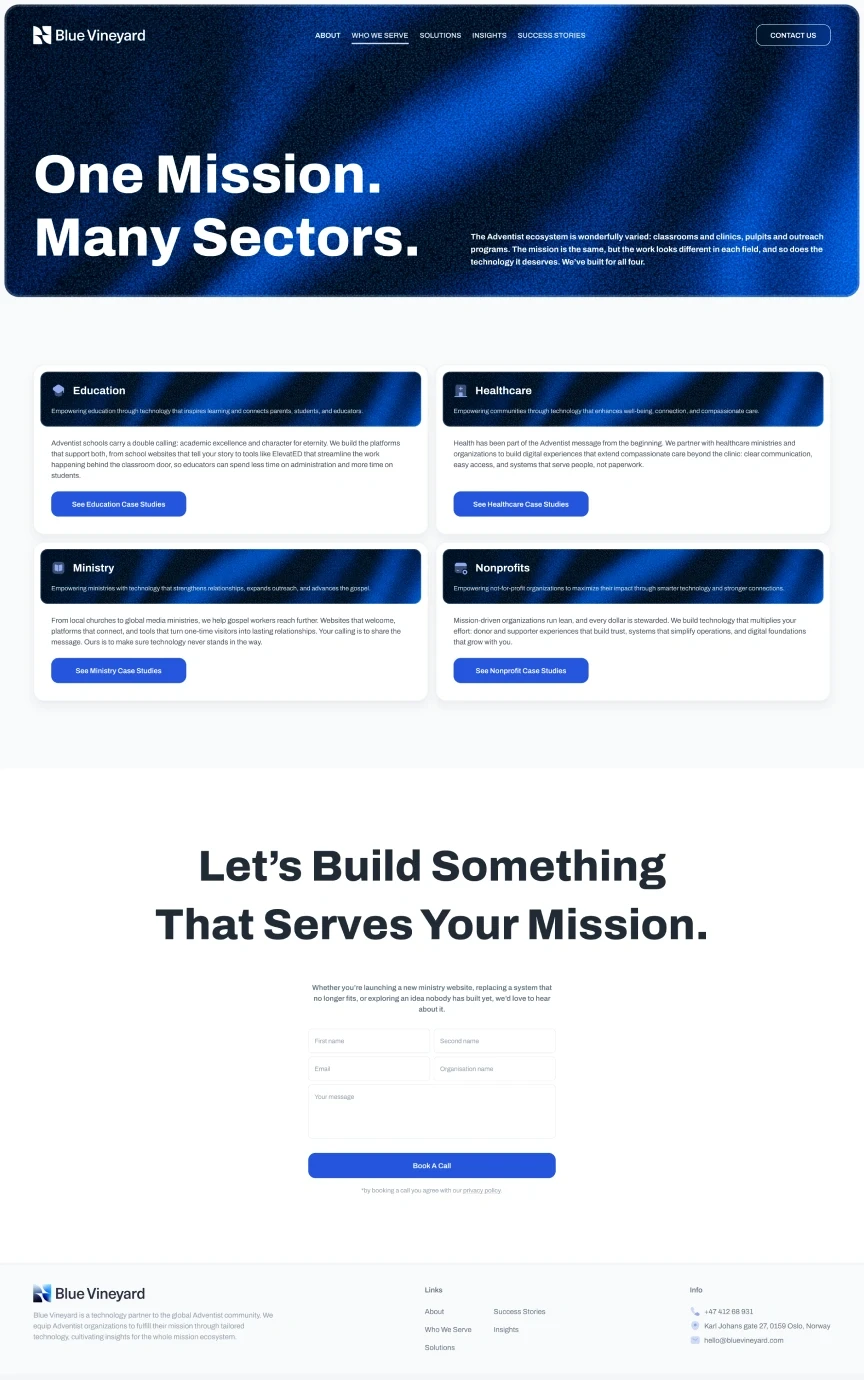
Sector pages in the reader’s language.

Why
Nobody thinks of themselves as “the education vertical”. They think of themselves as a school carrying a double calling.
Result
Who we serve splits into education, health, gospel and stewardship — each written from inside that world, not from the outside.
Four sector cards: Education, Healthcare, Ministry and Nonprofits, each with its own copy and case-study button.

Dark for conviction, light for reading.

Why
A homepage six and a half thousand pixels long needs a pulse, and the brand blue is too strong to read long copy on.
Result
Statements sit on the deep blue gradient, long-form content on white, and the page alternates between them all the way down.

System

One kit for seven pages

The brand had to hold a website, three product sub-brands and a room full of partner logos. Everything on these pages comes out of one small kit.

Mark

The Blue Vineyard logo, reversed to white on the brand gradient.

One lockup, two grounds: colour on paper, reversed to white on the gradient. Shown as it ships in the header.

Typeface

  • Archivo ExtraBold — 120 / 96 display
  • Archivo Bold — 32 / 24 / 18 headings
  • Archivo SemiBold · Regular — 16 / 14 body

Palette · sampled from the build

  • Ink#0D0D0D
  • Night#161C24
  • Signal#2455DD
  • Haze#91AAEE
  • Mist#D3DDF8
  • Paper#F9FAFB

Blue does the talking, grey does the reading: the signal blue is kept for actions and section headers, everything else is ink on paper.

Page by page

Seven pages, one argument

Each page carries one job and hands the reader to the next.

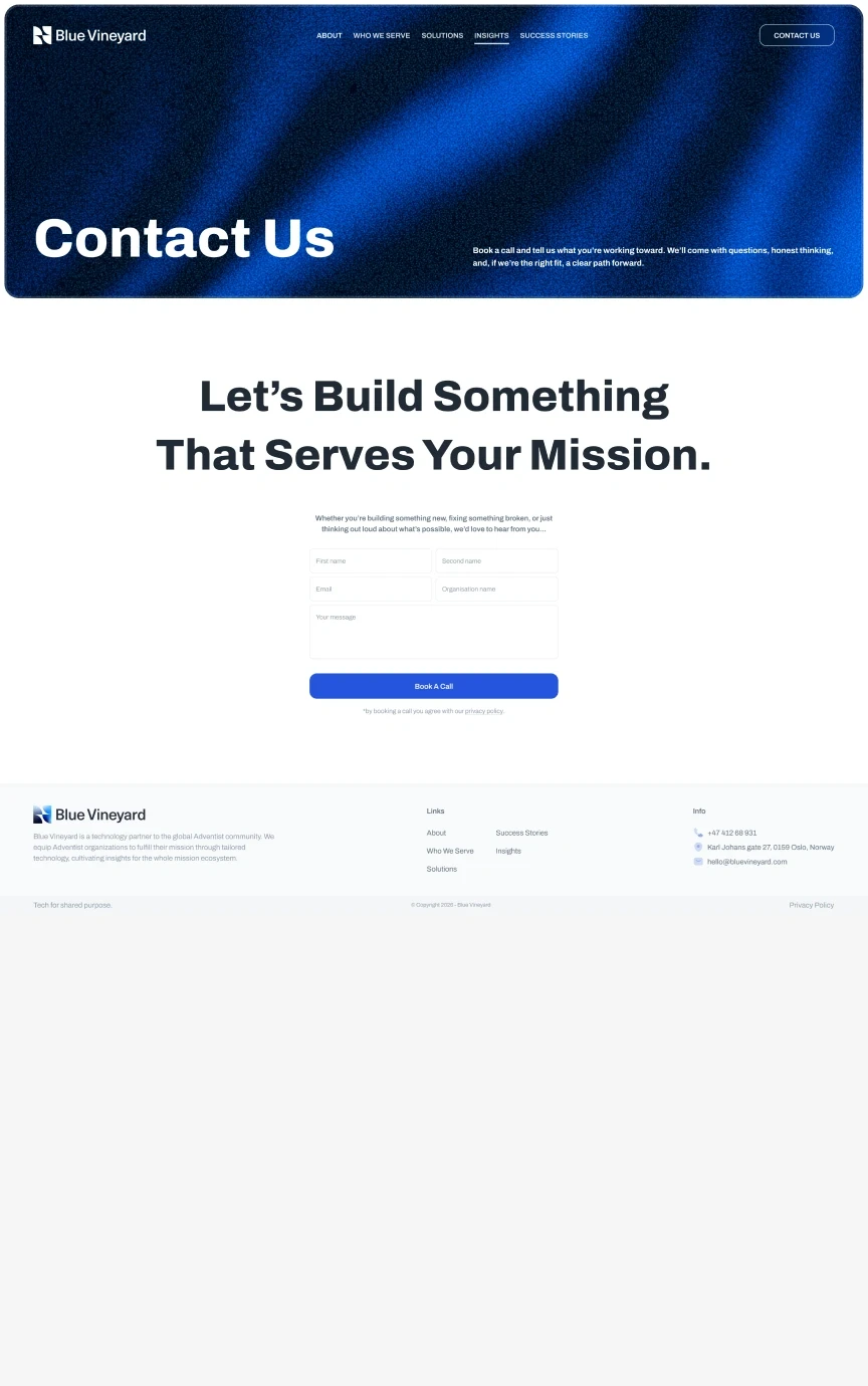
  • Blue Vineyard — Home page, top of the design

    Home

    The whole argument in one scroll: promise, proof, three doors, cases, voices.

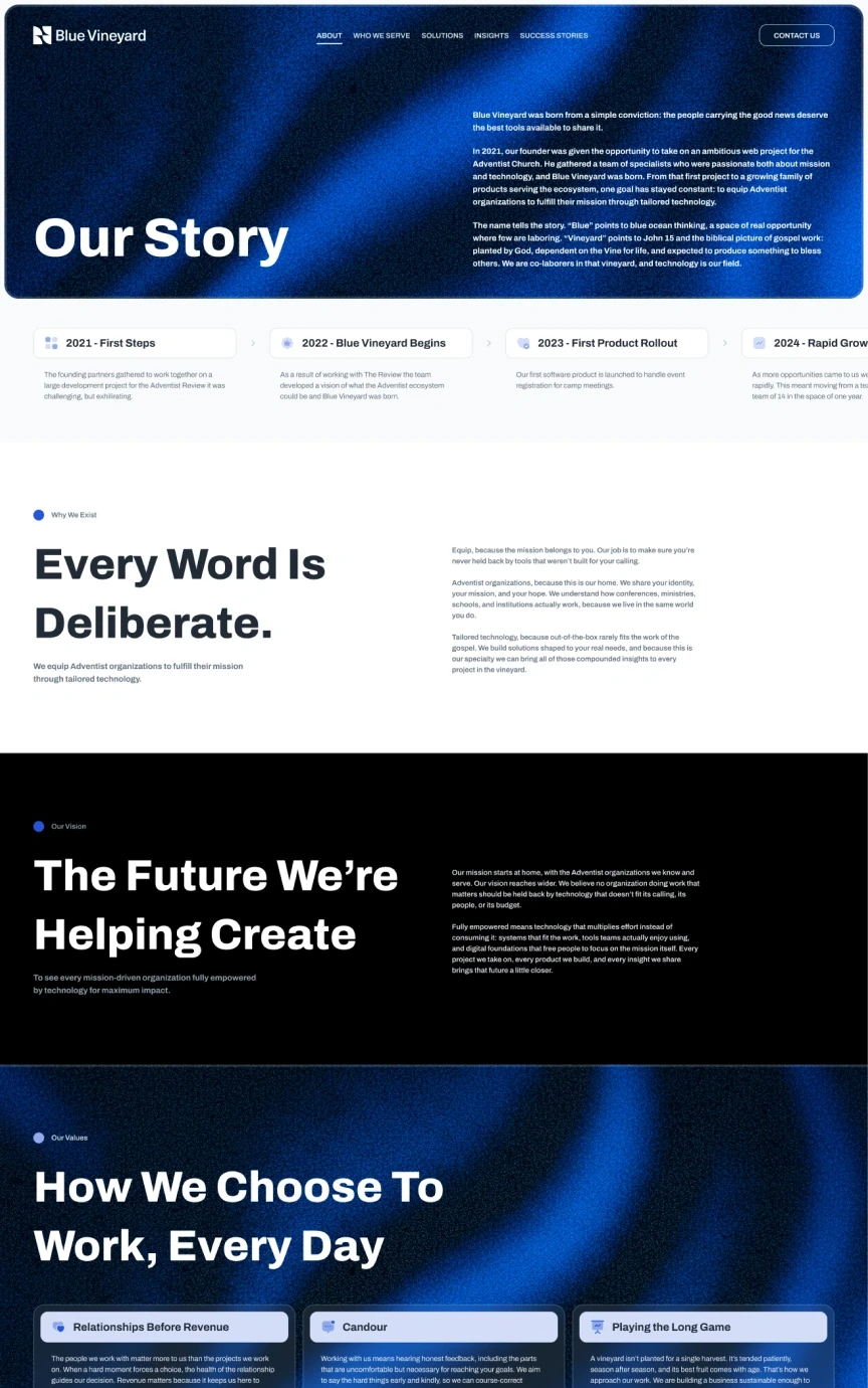
  • Blue Vineyard — About page, top of the design

    About

    2021 → today, why every word is deliberate, and the people behind it.

  • Blue Vineyard — Who we serve page, top of the design

    Who we serve

    Four sectors, each written from inside its own world.

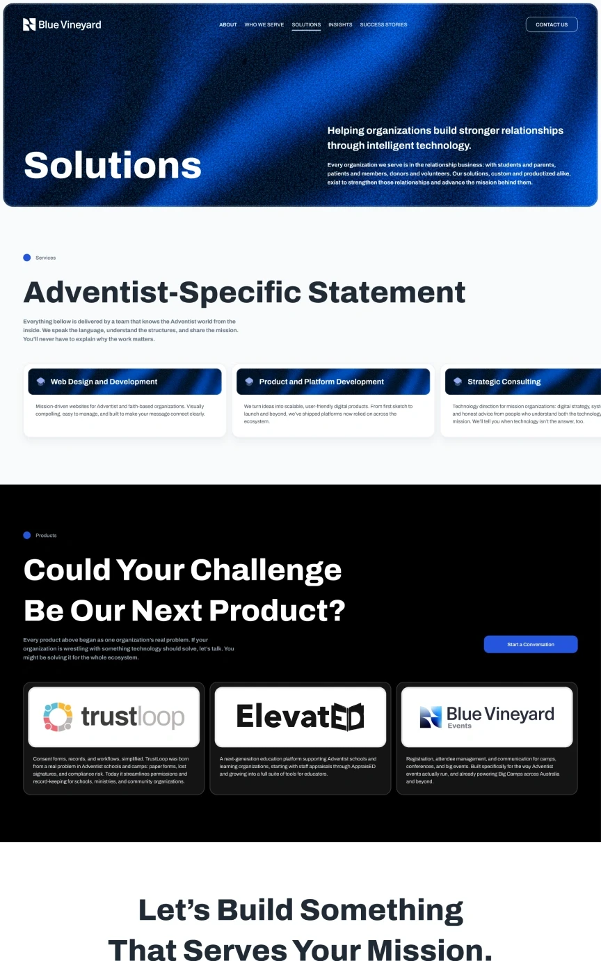
  • Blue Vineyard — Solutions page, top of the design

    Solutions

    Services and products — with an invitation to build the next one.

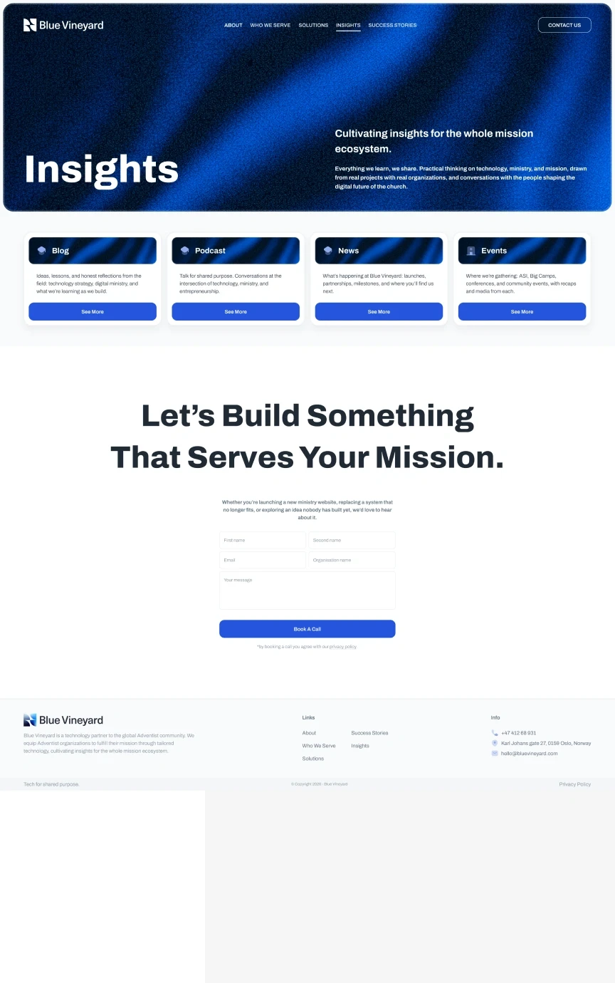
  • Blue Vineyard — Insights page, top of the design

    Insights

    Podcast, news and gatherings: the ecosystem’s noticeboard.

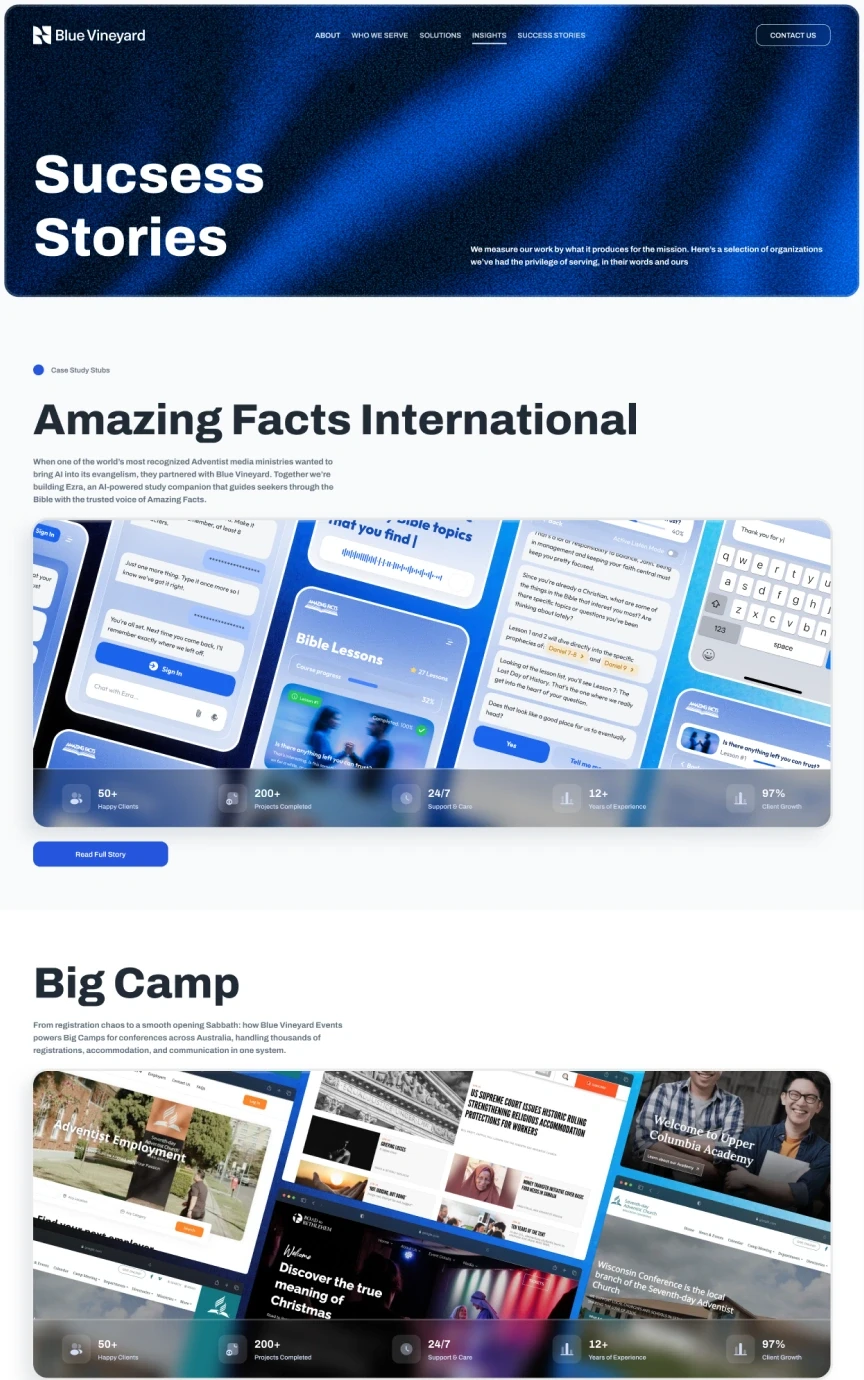
  • Blue Vineyard — Success stories page, top of the design

    Success stories

    Amazing Facts, Big Camp, Asian Aid — the proof in long form.

  • Blue Vineyard — Contact page, top of the design

    Contact

    One form, one promise, no maze.

Craft

The details that carry it

Three places where the design does quiet work.

The row of figures inside the hero: 97% client growth, 50+ happy clients, 12+ years of experience, 200+ projects completed.
Proof rowFive figures, five icon tiles, one line — the first thing under the headline, still inside the hero. Evidence reads faster than adjectives.
A close-up of the hero gradient: deep blue with visible noise.
GrainThe hero gradient is a rendered image with noise baked in, so a 1900-pixel blue field never bands on a cheap screen. A 400 × 260 crop, unscaled.
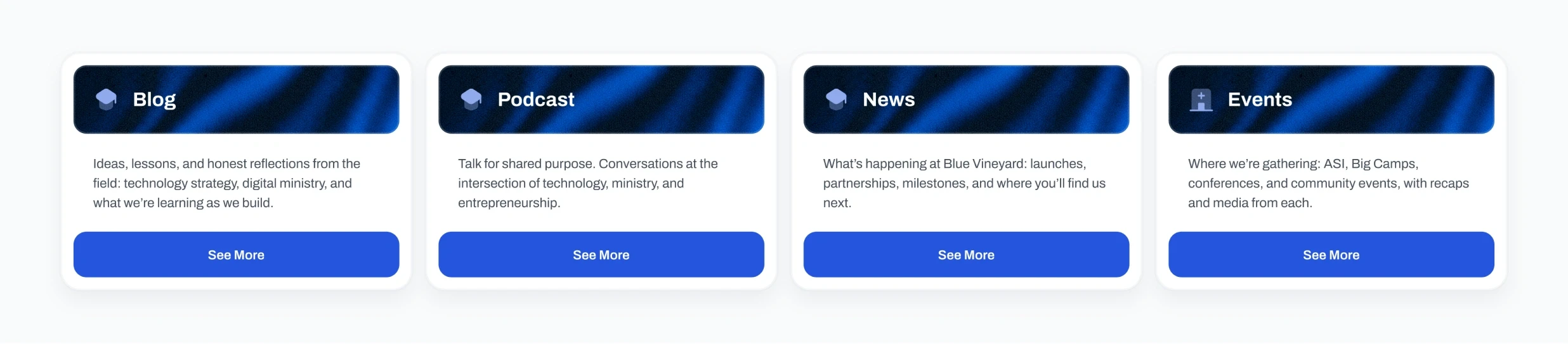
Four cards — Blog, Podcast, News, Events — built from the same component.
One card, three jobsThe same card carries a podcast, a news post and an event — one shape, three kinds of content, no new component.

Outcome

What shipped

Live
bluevineyard.com
Pages
Seven, designed end to end
System
One kit: type, palette, cards, chips, buttons
Brand
Mark, palette and type, built with the site

The client hasn’t shared traffic or conversion numbers, so there are none on this page. What can be checked: it is live, and all seven pages come out of the same kit.

Reflection

If I had another two weeks

What I’d test
The three doors. Solutions / Products / Partnership are the riskiest labels in the whole architecture — they are the client’s language, not the reader’s.
What I’d measure
Which page starts the conversation. The closing block is identical everywhere, so the entry point is the only signal the site gives back.
What I’d change
Give the products their own level. TrustLoop, ElevatED and Events are doing the work of a second brand inside one section of someone else’s site.

End of case 01

Seen enough? Let’s talk about yours.