← Back to work

Case 09 — Landing page · Web3 lending

A presale page that has to earn trust before it asks for money.

Client
GTT
Scope
Presale landing · 13 sections
Sector
Web3 · lending & staking
Status
Shipped
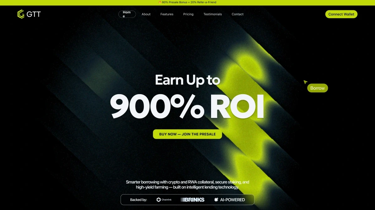
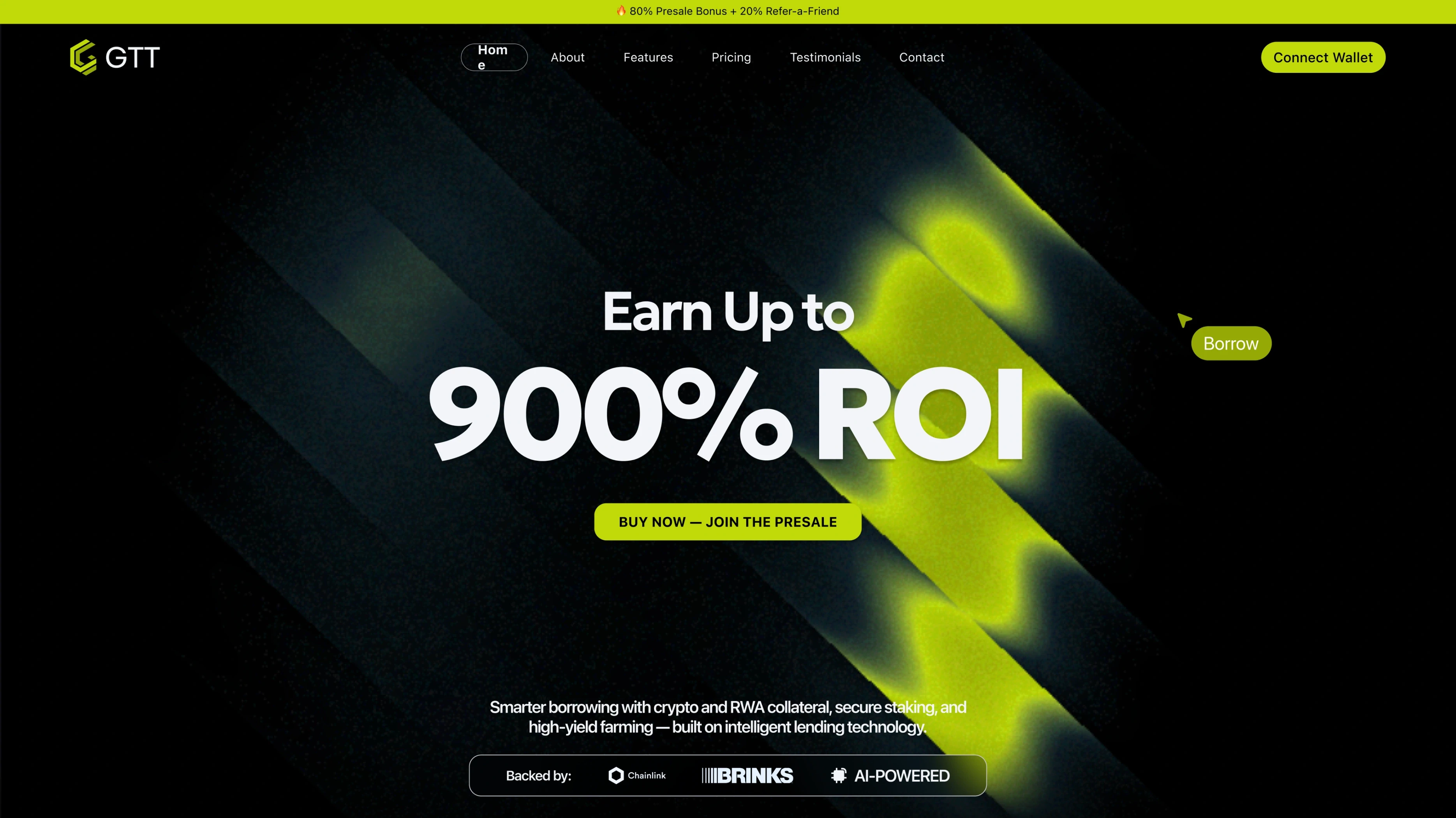
The first screen of the GTT landing: “Earn up to 900% ROI”, Buy now — join the presale, a line on crypto and RWA collateral, the backers row, the countdown and the raise so far.
First screenThe offer, the raise so far and the countdown — before a single scroll.

Context

GTT describes itself as the first AI-driven Web3 lending and staking platform: loans against more than a hundred cryptocurrencies and against real-world assets — gold, art, luxury goods — held in physical custody, with staking and yield farming on top.

This page is its presale landing: the one place where the token is explained, the raise is shown, and visitors are asked to buy.

Problem

Big numbers, a wary audience.

“Smarter borrowing with crypto and RWA collateral, secure staking, and high-yield farming — built on intelligent lending technology.”

GTT, first screen

Presale visitors have seen every promise before. The page had to put its offer up front and, right beside it, the reasons to believe it: audited contracts, KYC, a named custodian, a live count of the raise — and explain a product that mixes crypto loans with gold in a vault.

Constraints

Working within constraints

Audience
Crypto natives who have seen every presale
Product
Crypto loans and real-world-asset loans in one platform
Compliance
No KYC for crypto loans, three-step KYC for RWA
Time
A presale countdown and a live raise
Motion
Animated sections handed to a motion designer
Content
Parts of the copy still placeholder in the file

In the file

One long page, section by section

  • First screen
  • Animated phones
  • Traction
  • How it works
  • Products
  • Explainer video
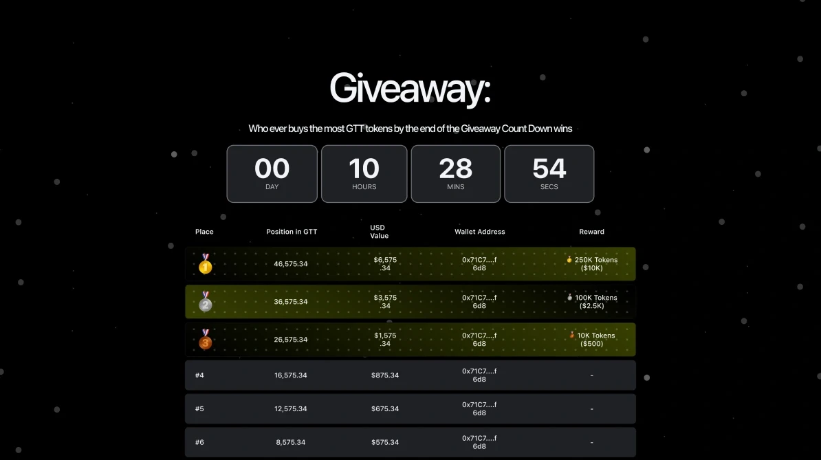
  • Giveaway
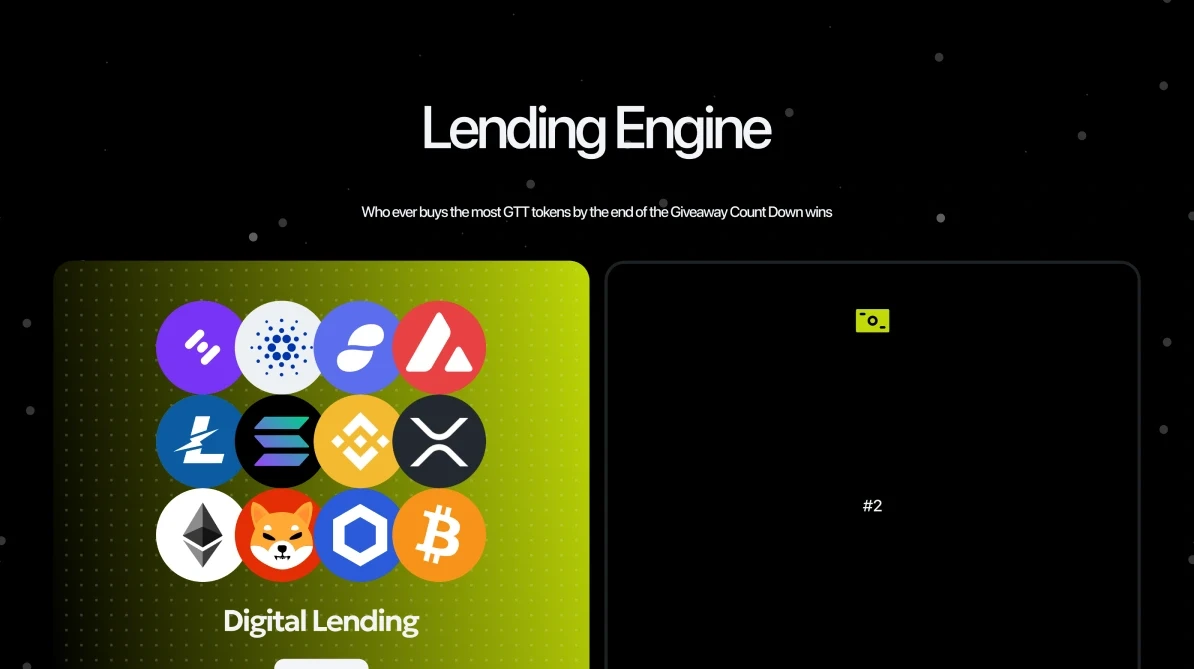
  • Lending engine
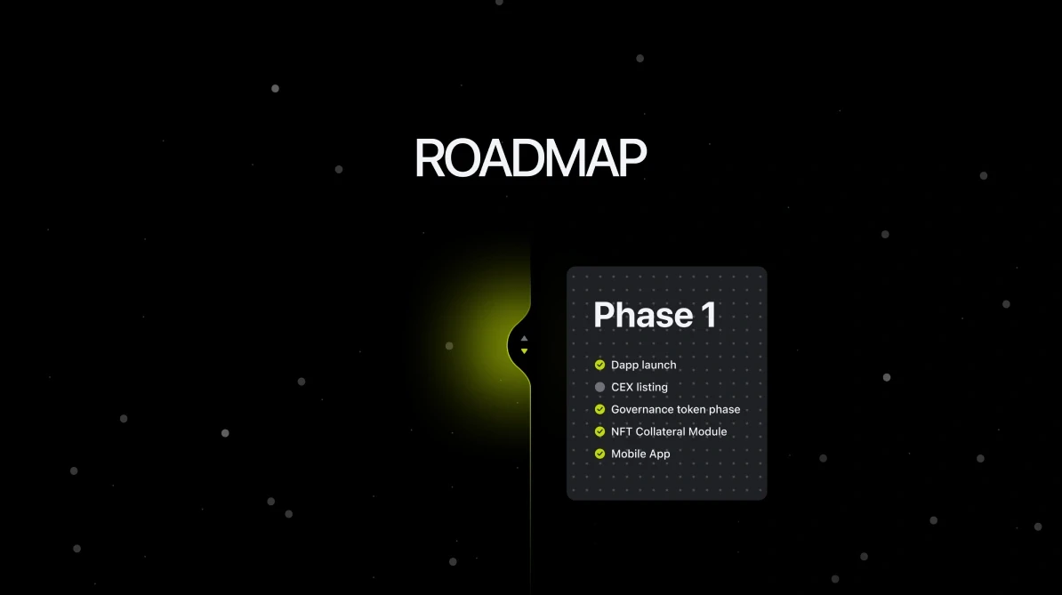
  • Roadmap
  • Tokenomics
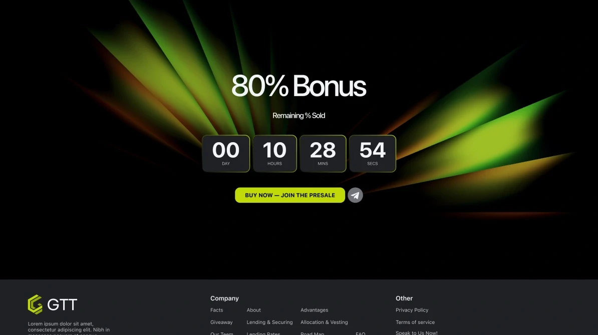
  • Final call

Decisions

Decisions that shaped the page

The offer and its proof on one screen.

Why
Presale visitors decide in seconds, and they arrive suspicious.
Result
The first screen holds the offer and the call to buy, who backs it — Chainlink, Brinks — the countdown, and the raise so far with the share already sold.
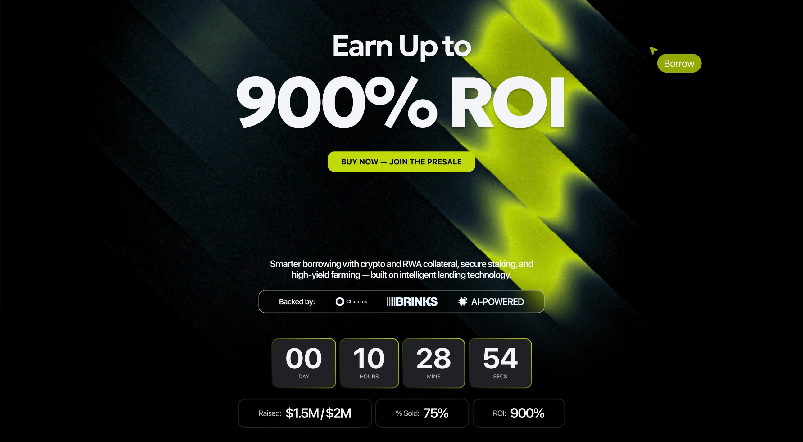
“Earn up to 900% ROI” and Buy now — join the presale; under them “Backed by: Chainlink, Brinks, AI-powered”, the countdown, and Raised $1.5M / $2M, 75% sold, ROI 900%.

Two ways to borrow, told apart by KYC.

Why
Crypto borrowers avoid identity checks; loans against gold or art can’t skip them.
Result
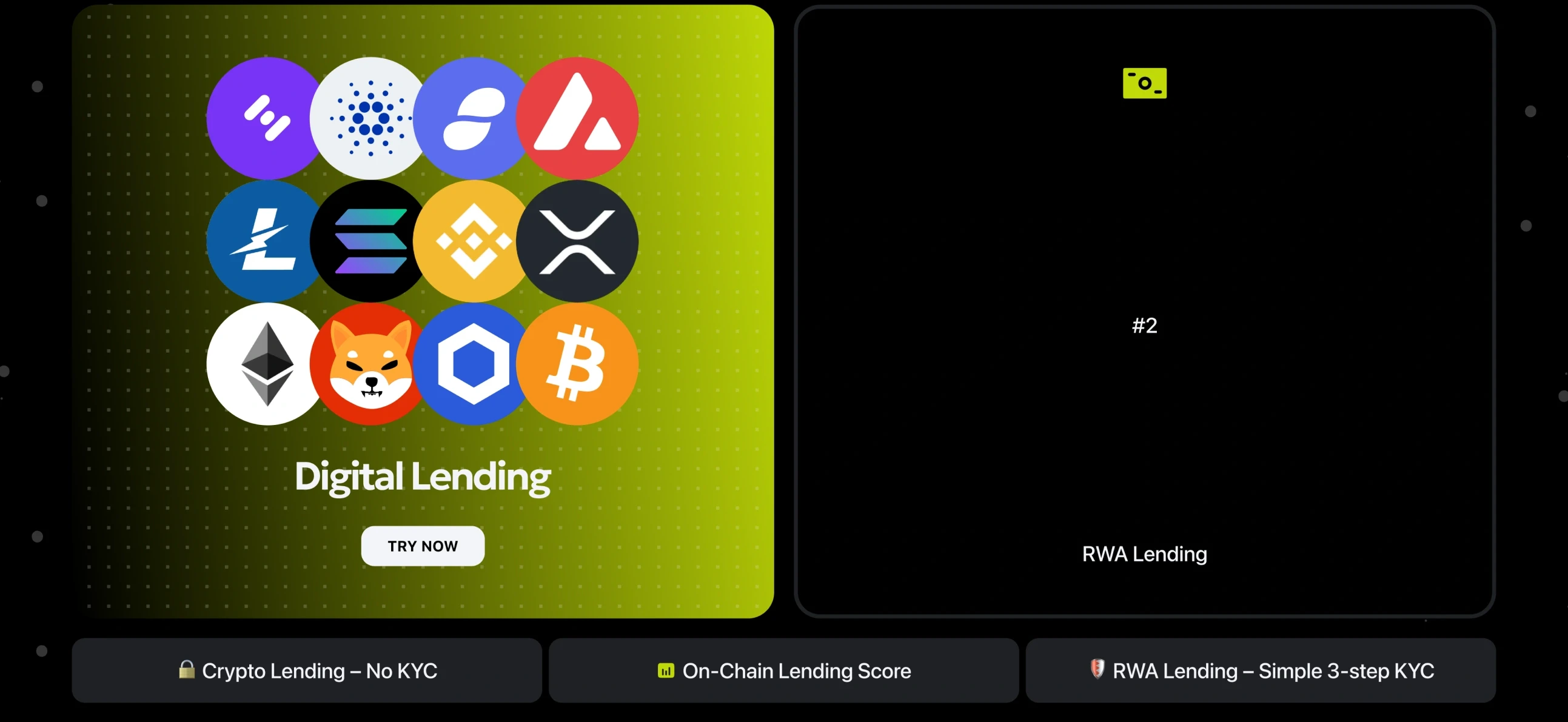
Digital borrowing, RWA borrowing and staking stand as three products; crypto lending is marked ‘no KYC’, RWA lending ‘simple 3-step KYC’.
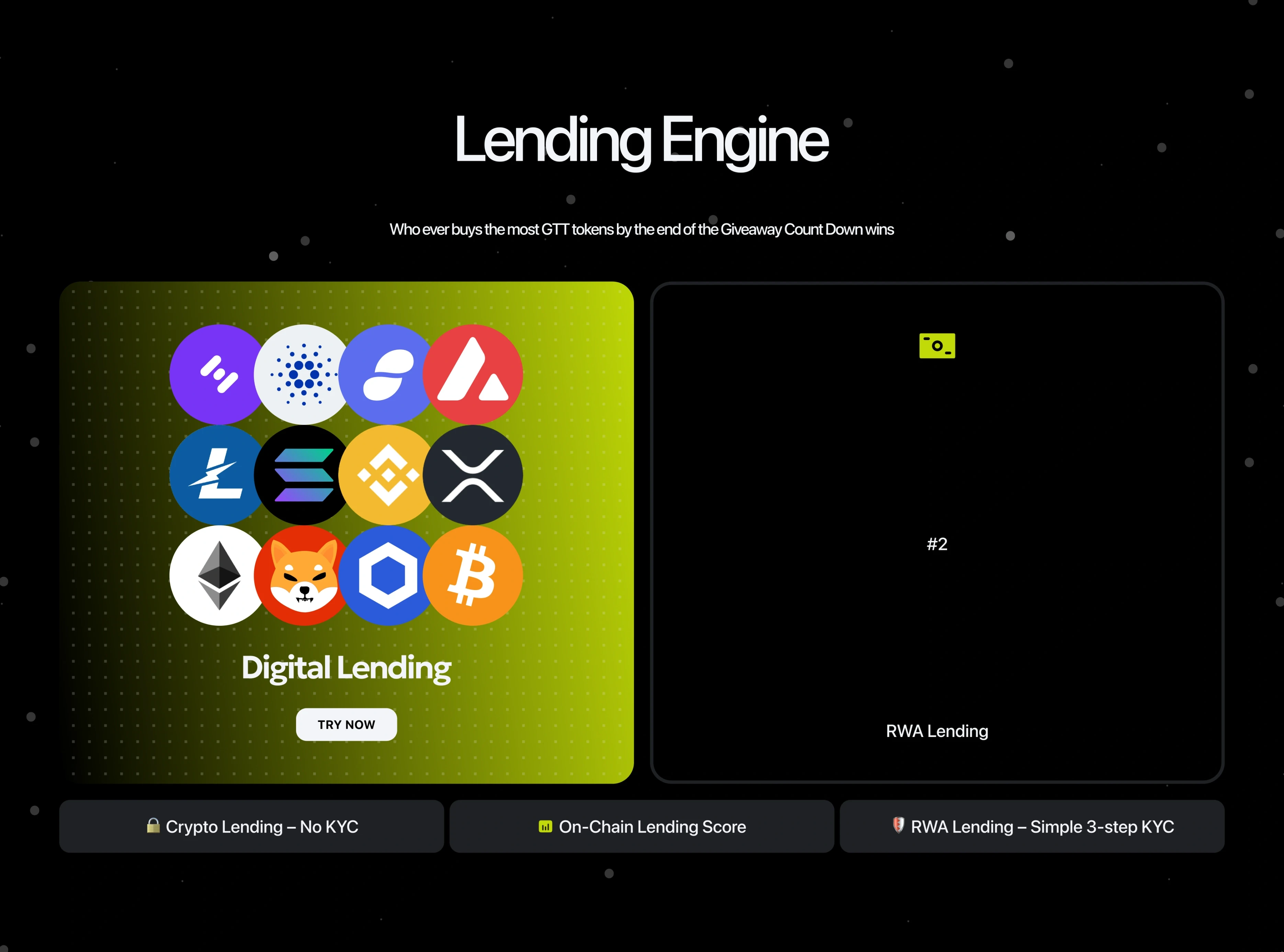
Digital lending, a card of coin logos with Try now, beside the RWA lending card, and under them: crypto lending — no KYC, on-chain lending score, RWA lending — simple 3-step KYC.

A giveaway you can see yourself in.

Why
A countdown alone is pressure; a leaderboard is a game.
Result
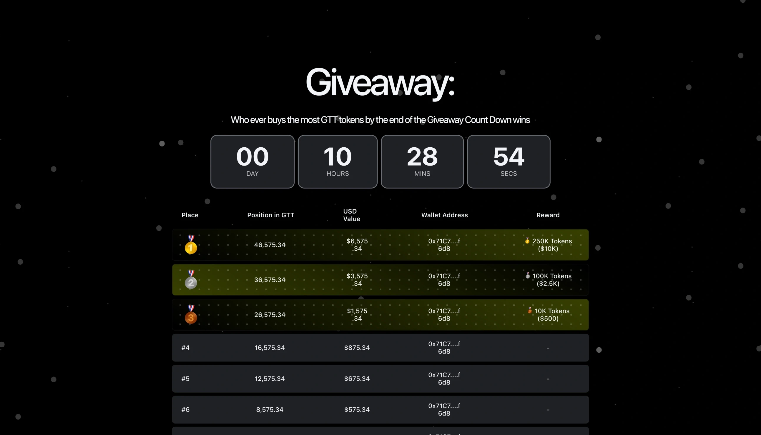
The giveaway shows the prizes, the time left and every buyer’s position, so the biggest buyer at the deadline — and everyone chasing them — is on the page.
Giveaway: “Whoever buys the most GTT tokens by the end of the giveaway countdown wins”, the countdown, and the leaderboard — place, position in GTT, USD value, wallet address and reward, the top three highlighted.

Motion written into the design.

Why
A page about ‘intelligent’ technology has to move, and motion is what gets lost between design and build.
Result
The animated sections are marked in the file itself — ‘*Animated phones section’, ‘Platform explainer — how it works, *animated section by Yan’ — so the build knows what moves and who animates it.
A placeholder with a play button and the note “*Animated phones section”.
A placeholder with a play button: “Platform explainer — how it works”, and the note “*Animated section by Yan”.

System

Black, and one electric colour

A black page with a single neon accent for everything that asks for action — the buy button, the countdown, the numbers that matter.

Typeface

  • Geologica — the whole page
  • Bold for offers and numbers
  • Regular for explanations

Palette · sampled from the page

  • #F3F5F9
  • #C5C6CC
  • #1F2024
  • #000000
  • #71727A
  • #C0D908

Solid fills, sampled by frequency from the whole landing.

The page

Top to bottom, in eight screens

Each slice is one screen of the landing.

  • The first screen: the 900% ROI offer, the call to buy and the backers.

    First screen

    Offer, raise, countdown.

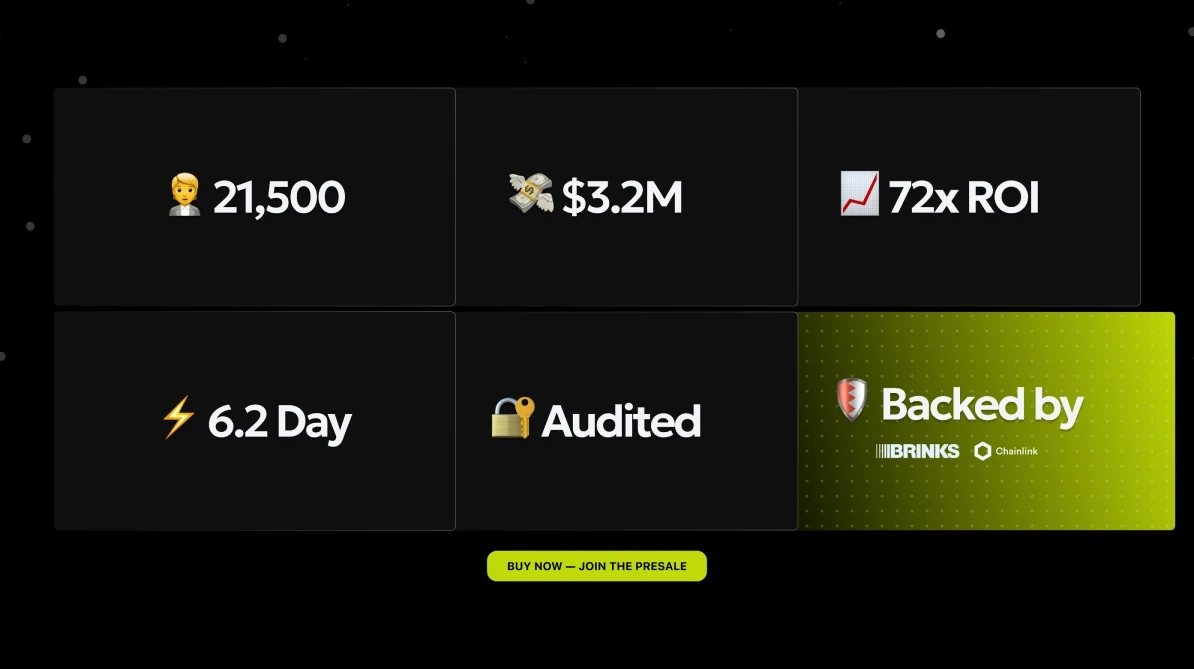
  • Six tiles: 21,500, $3.2M, 72x ROI, 6.2 day, Audited, and Backed by Brinks and Chainlink.

    Traction

    Numbers and backers, as six tiles.

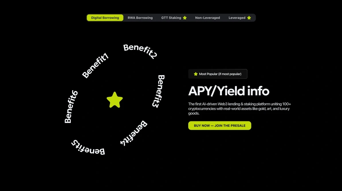
  • Products: tabs for digital borrowing, RWA borrowing, GTT staking, non-leveraged and leveraged, a ring of benefits, and APY / yield info.

    Products

    Borrow, borrow against assets, stake.

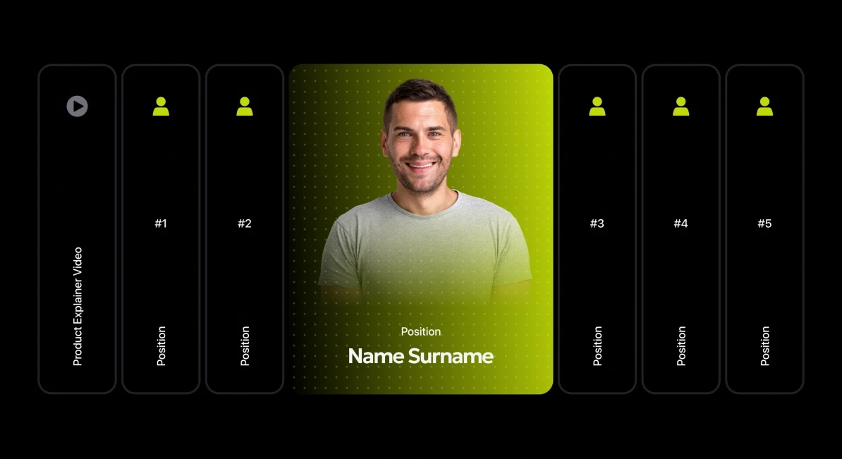
  • The product explainer video section: a row of vertical cards, one open with a portrait.

    Explainer video

    The product in motion.

  • The giveaway: the countdown and the leaderboard.

    Giveaway

    Prizes, positions, time left.

  • Lending engine: the digital lending and RWA lending cards.

    Lending engine

    Digital and RWA lending, side by side.

  • Roadmap, Phase 1: dapp launch, CEX listing, governance token phase, NFT collateral module, mobile app.

    Roadmap

    Phases from dapp launch on.

  • The final call: an 80% bonus, the countdown and the buy button, above the footer.

    Final call

    The bonus and the button, one more time.

Craft

The detail that carries it

Lending engine: the digital lending card with its coin logos and Try now, the RWA lending card folded to its number, and the rules underneath — crypto lending, no KYC; on-chain lending score; RWA lending, simple 3-step KYC.
Lending engineTwo ways to borrow as two cards — digital lending open, RWA lending folded to its number — with the KYC rule for each underneath. The RWA card’s open state (Chainlink price feeds, Brinks custody, ERC-721 NFTs, 75% LTV in under 24 hours) is drawn in the file, with its layer switched off.

Outcome

What shipped

Status
Shipped
Surface
One landing page, thirteen sections
Presale
Countdown, raise progress, leaderboard
Motion
Animated sections specified in the file

The figures on the page — the raise, the signups — are the client’s presale numbers, not results of the design. No design metrics were shared.

Reflection

If I had another two weeks

What I’d test
Whether the ‘no KYC’ promise pulls more buyers than the real-world assets do — the page gives both equal weight.
What I’d measure
How far down people scroll before buying. Thirteen sections is a lot of page for one button.
What I’d change
Replace the remaining placeholder copy before anything else; a presale page with lorem ipsum loses the trust it works for.

End of case 09

Seen enough? Let’s talk about yours.