← Back to work

Case 08 — Website · Food & drink

A juice site where the bottle pours itself.

Client
Poppy Jacks — cold-pressed juice, Miami Beach
Role
Design & development
Scope
One page · eight screens
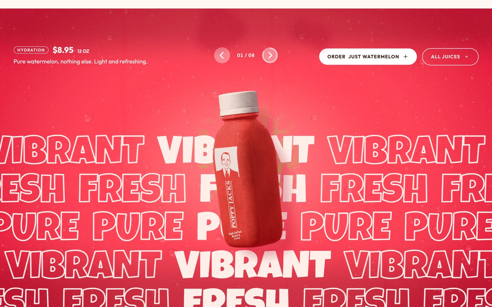
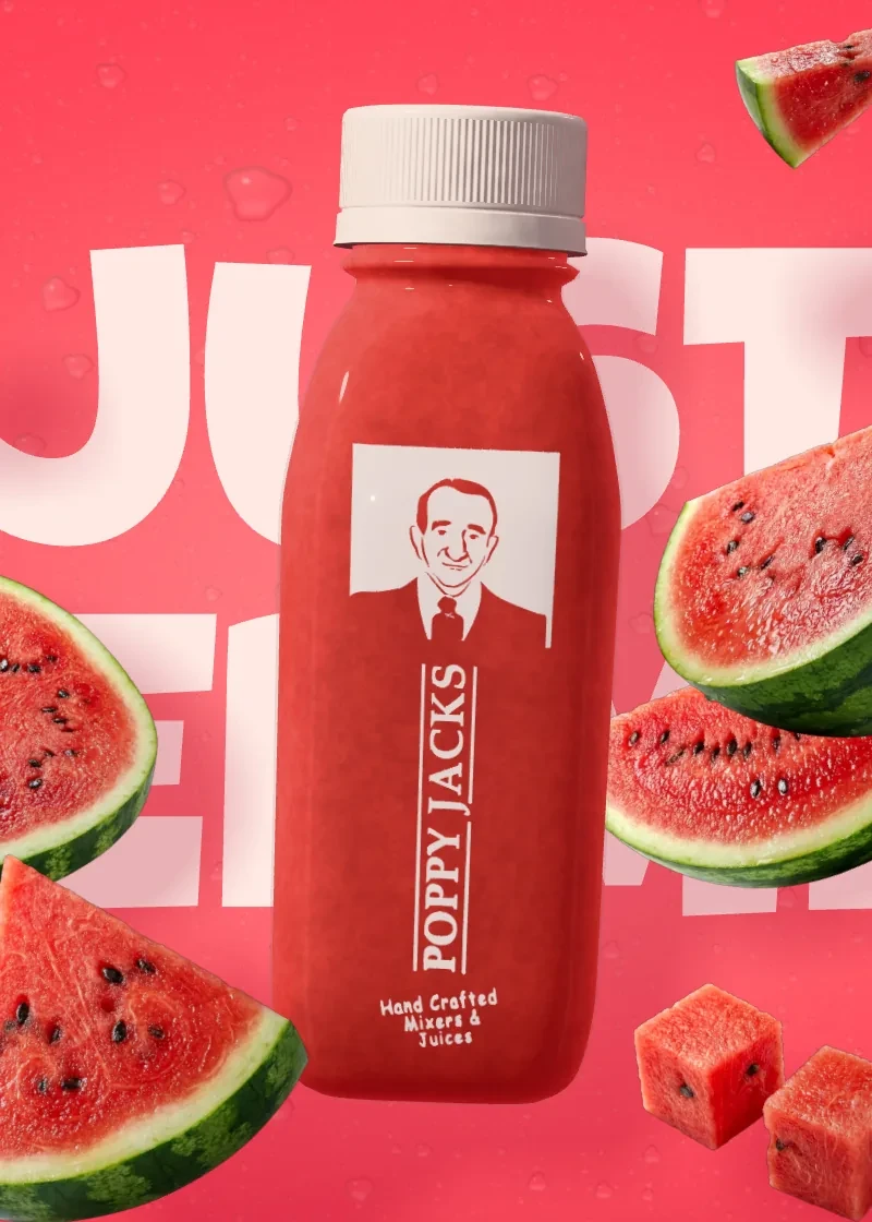
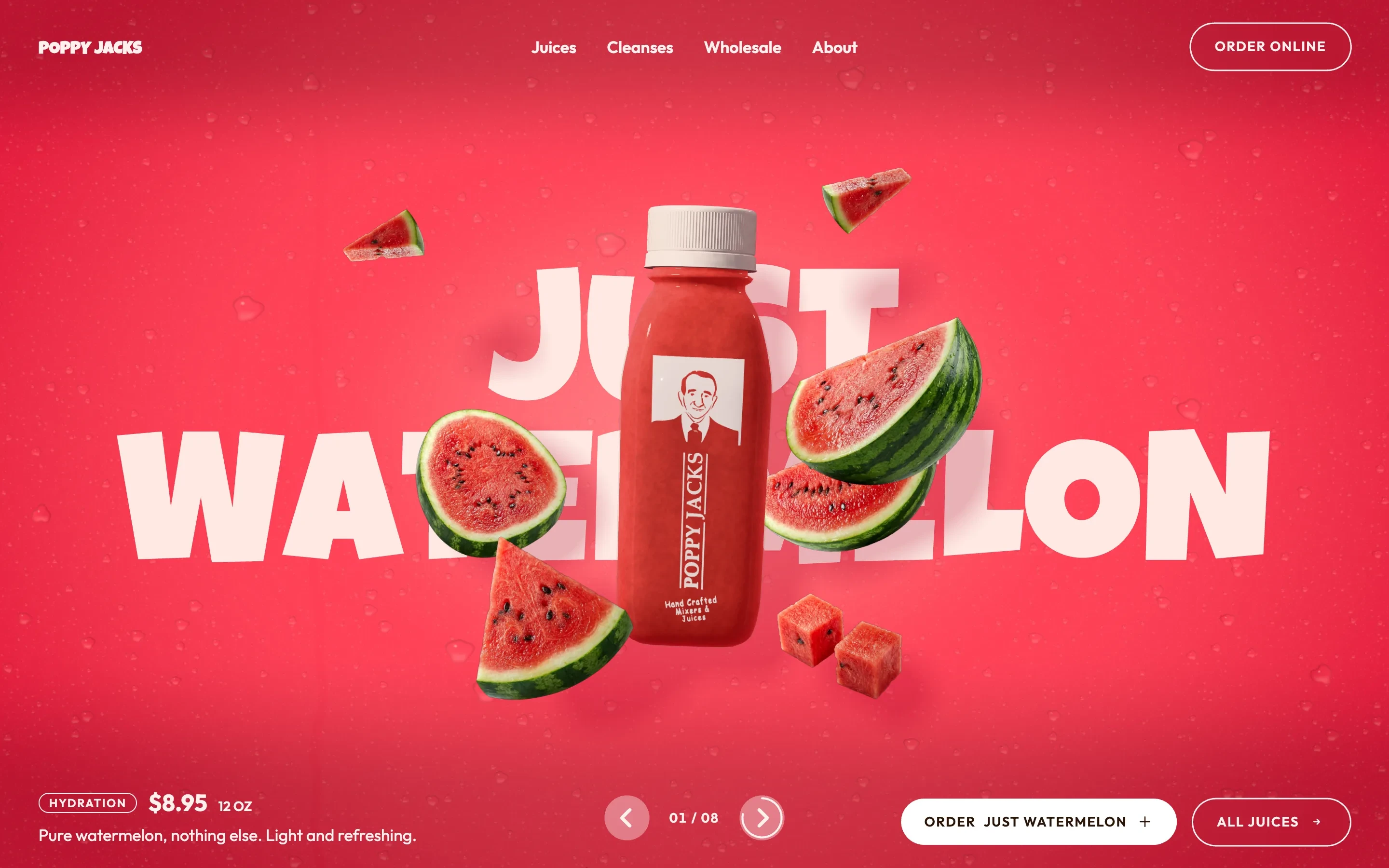
The first screen: “Just Watermelon” in huge letters across a watermelon-red field, a 3D bottle of the juice in front of them with slices and cubes of watermelon around it; the price, $8.95 for 12 oz, at the bottom left, the slider’s arrows in the middle and Order Just Watermelon at the right.
First screenThe juice’s name across the screen, the bottle in front of it, its fruit around — and the price and the order button at the bottom.

Context

Poppy Jacks makes cold-pressed juice and cocktail mixers in Miami Beach, at 6622 Collins Avenue. Juices, shots, cleanses and mixers are ordered online through Otter, for delivery or pickup; bars and hotels buy the mixers wholesale.

The brand already had a site, poppyjacks.com. The new one keeps what it says — the slogan, the reasons, the menu — and changes how the juice is shown.

Designed and built for the brand to review, it runs at its own address; poppyjacks.com still shows the old site.

Problem

Eight juices, one first screen.

The site has one main job — get a visitor to the order on Otter — and a second one: get a bar, a hotel or a café to ask about wholesale.

Eight juices had to share the first screen, each in its own colour, and every name, price and ingredient on the page had to be the brand’s own, word for word from its menu on Otter.

Constraints

Working within constraints

Facts
Names, prices and ingredients only from the Otter menu — none typed by hand
Ordering
Orders and payment stay on Otter; the site leads there
Brand
Close to poppyjacks.com in what it says — improved, not a new brand
Rule
The juice’s name always in the middle of the first screen
Speed
Live 3D at 60 frames a second, on a Retina laptop and a 3440-wide screen
Phones
A plain page on touch screens — the live bottle only on the first one

What I owned

From the first sketch to the live site

  • Design in Figma
  • 3D bottle & juice
  • Juice switch
  • Scroll scenes
  • Menu from Otter
  • Phone layout
  • Performance
  • Accessibility
  • Build & deploy

Decisions

Decisions that shaped the page

The juice is the first screen.

Why
A product photo shows one bottle the same way every time; the brand has eight juices and a colour for each.
Result
One live three.js bottle becomes each of the eight. Switch the juice and the field turns to its colour in a wave from the bottle, the bottle turns once and fills with the new juice from the top down, the fruit circles it and comes back as the new ingredients, and the name rolls in letter by letter.
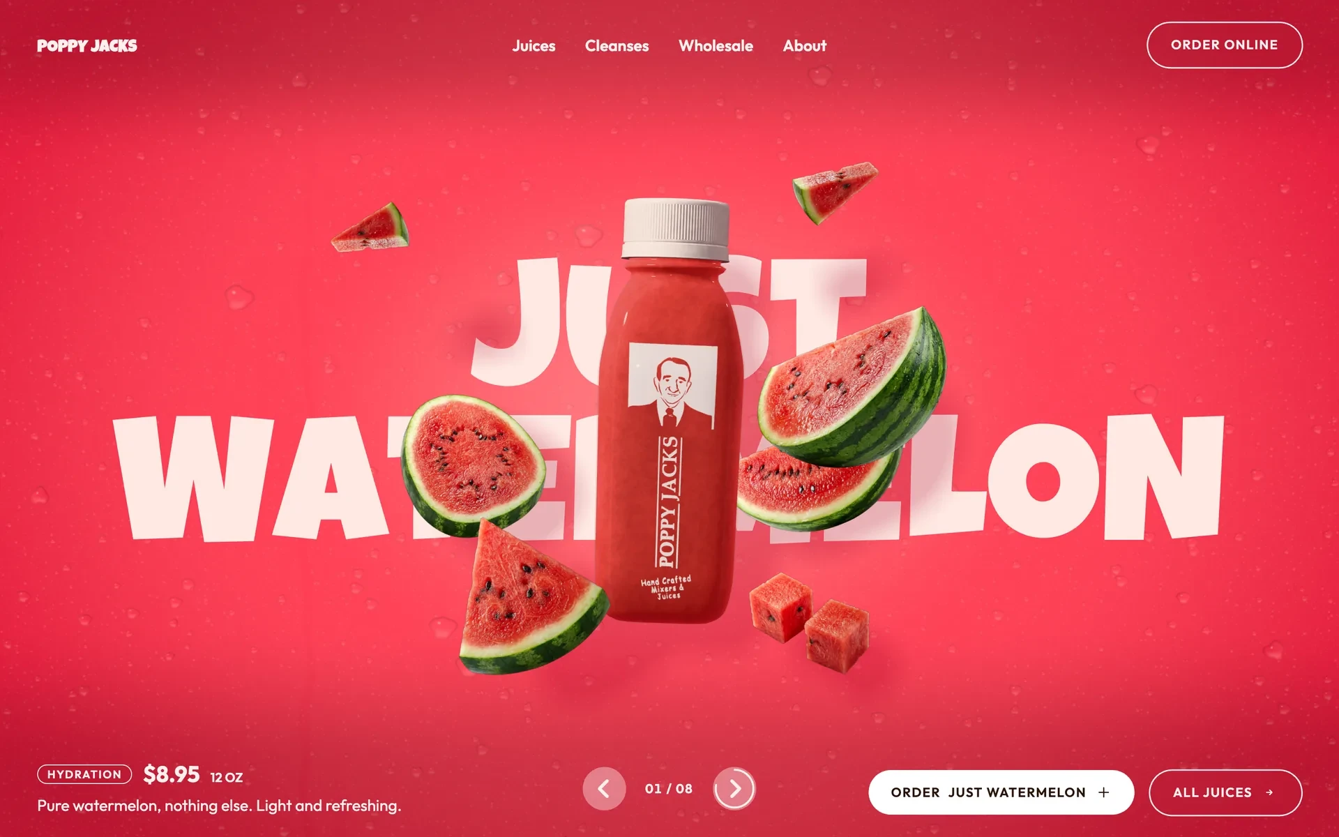
Watermelon · Garden of Eden · Wheel of the SoulTwo clicks on the arrow, in real time.

Three short stories on one screen that holds.

Why
The slogan, the three reasons to buy and the three steps to an order are each a few lines; one under another they would be a long scroll of small blocks.
Result
They share one screen that holds still while it changes: a wave of the next juice’s colour spreads from the bottle and opens the next slide, the bottle stays and refills, and the texts roll in letter by letter. Scrolling back plays it in reverse.
Slogan · why · steps

The whole menu, straight from Otter.

Why
A menu typed out by hand starts to disagree with the order page the first time a price changes.
Result
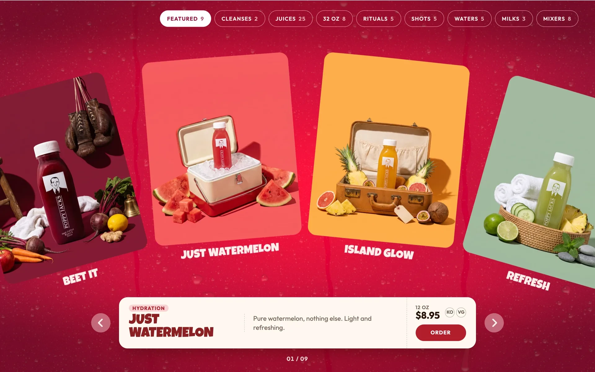
All 61 items in their Otter categories, on a curved strip that turns as you scroll, with one card under it for the item in the middle. The menu is generated from the Otter text by a script, and every Order leads to Otter.
Featured · 9 of 61

Wholesale gets a scene of its own.

Why
Bars and hotels are the second audience, and a contact line at the bottom of a juice page is easy to miss.
Result
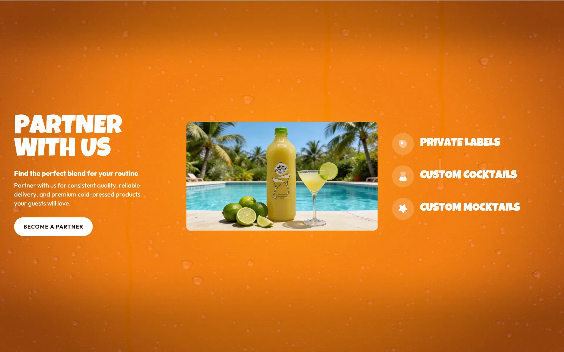
Photos of the mixers at work — a rooftop bar, a beach club, a spa by the pool — rise and part as the screen holds, until one stays as a card beside the offer: private labels, custom cocktails, custom mocktails, and a form to become a partner.
The scenes around the centre were generated from the brand’s own bottle.

System

A colour for every juice

Each juice brings its own field — light in the middle, deep at the edges — and everything else is white type on top of it.

Typefaces

  • Luckiest Guy — juice names, headings
  • Outfit — running text, prices, buttons
  • On the first screen the name fills the width

Palette · six of the eight juices

  • Just Watermelon#FF3F55
  • Garden of Eden#7CA93C
  • The Healer#F27D00
  • Lotus#2B6C41
  • Beet It#AC0050
  • Pineapple Express#FFB622

Each juice has three tones — a light centre, a middle, a deep edge — taken from the brand’s approved Instagram set. The slider’s order puts the most different colours side by side, so every switch reads as a change.

The page

One bottle, eight screens

Each slice is one screen of the site at 1440.

  • The first screen: Just Watermelon, the bottle and the watermelon around it.

    First screen

    The juice, its name, its price.

  • Rows of FRESH, PURE, VIBRANT across the screen with the bottle passing in front of them.

    Slogan

    The brand’s three words.

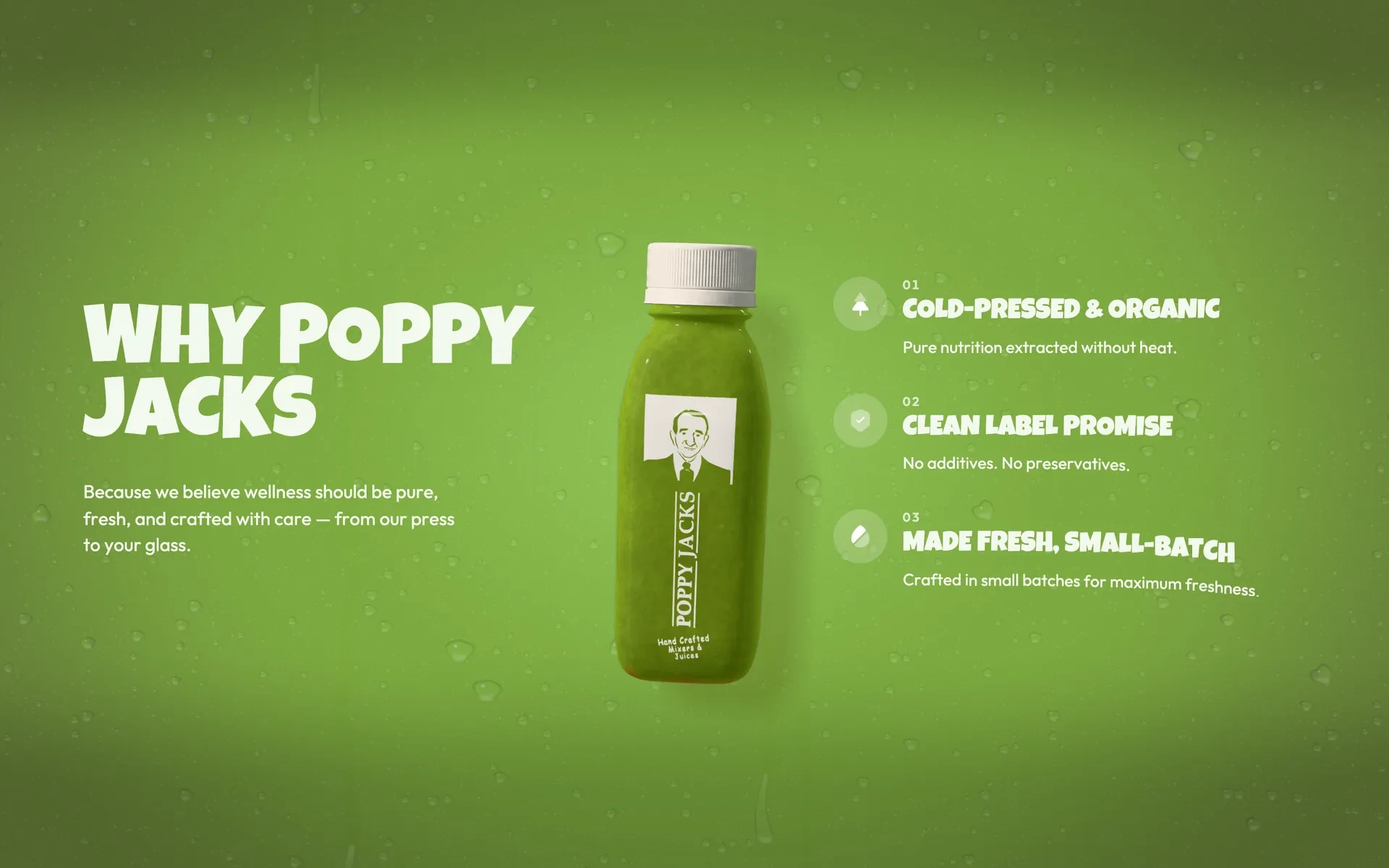
  • Why Poppy Jacks on green: the bottle in the middle, the heading at the left, three reasons at the right.

    Why

    Three reasons, in the next juice’s colour.

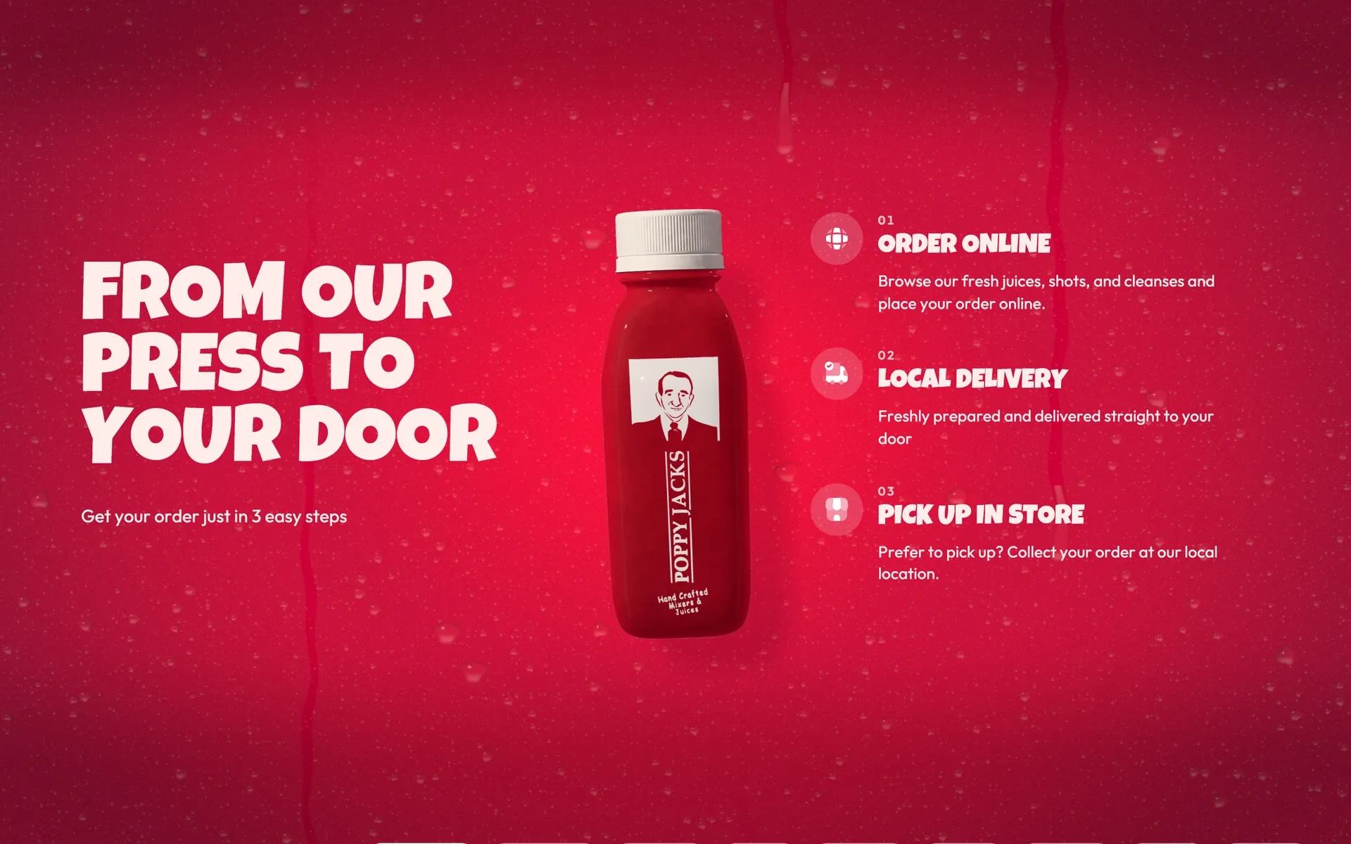
  • From our press to your door on red: order online, local delivery, pick up in store.

    Steps

    Three ways to get it.

  • The menu: tabs at the top, juice cards on a curved strip, the card of Just Watermelon underneath.

    Menu

    61 items from Otter.

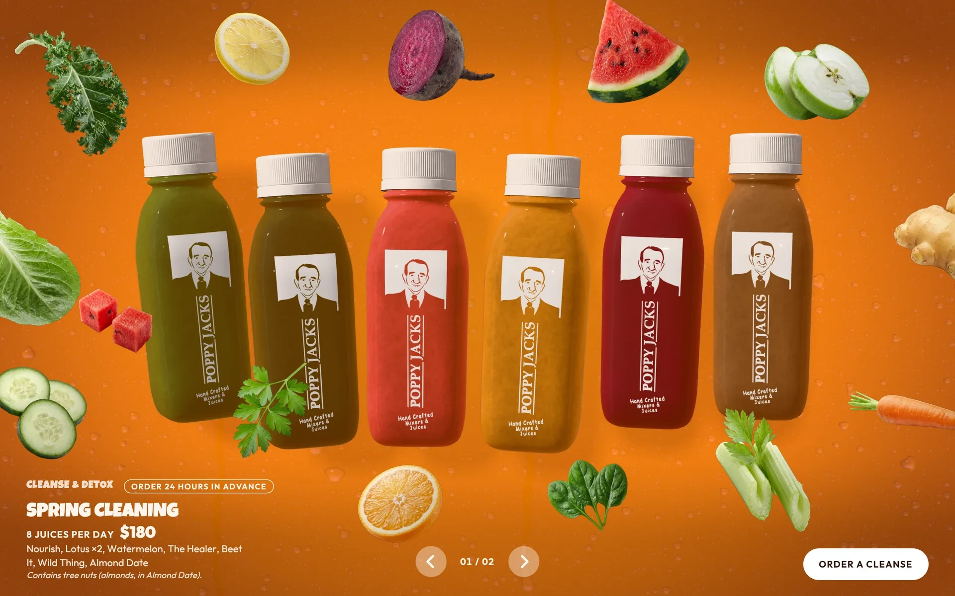
  • Cleanse & Detox on orange: six bottles of the day’s juices in a row, their ingredients around them.

    Cleanses

    Eight juices a day, ordered a day ahead.

  • Partner with us: a photo of a lime mixer by a pool as a card, the offer at the left, three services at the right.

    Wholesale

    For bars, hotels and cafés.

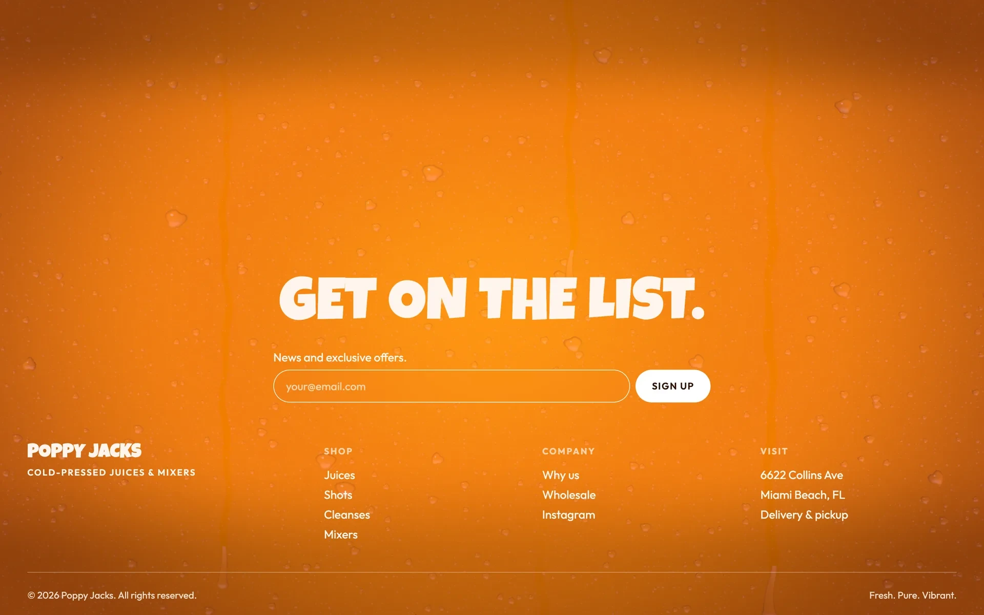
  • The footer: Get on the list. with an email field, and the links and the address below.

    Footer

    The list, the links, the address.

Craft

The detail that carries it

Menu to cleansesPast the last item, the menu burns away from the middle in the cleanses’ colour — and the cleanses are already standing underneath: six bottles of the day’s juices.
The menu card at actual size: Hydration, Just Watermelon, “Pure watermelon, nothing else. Light and refreshing.”, 12 oz, $8.95, KO and VG, Order; arrows at both sides and 01 / 09 below.
One card, 61 itemsWhat it is, what’s in it, the price and Order — the same height for every one of the 61 items, so the strip above it never jumps.
A close-up of the 3D bottle of Just Watermelon: a white cap, the red juice behind the plastic, the brand’s label with its portrait, watermelon around it.
The bottleEvery juice is the same 3D bottle. The juice inside is a shader, so it can sway, settle and pour from one colour into the next.

Outcome

Where it stands

Status
Live — at its own address, for the brand to review
Made for
Poppy Jacks, Miami Beach
Content
Menu, prices and cleanses as on the brand’s Otter menu, 21 October 2026
Surface
One page — desktop, and a plain page for phones

The site isn’t on poppyjacks.com yet, so there are no orders to report.

Reflection

If I had another two weeks

What I’d test
Whether the live bottle gets more people to Order than a photo of the same juice would.
What I’d measure
How many visitors switch juices before they scroll, and which juice they open the order for.
What I’d change
Give the self-advancing slider a pause button — it already stops on hover, on focus and while you scroll, but WCAG asks for one you can press.

End of case 08

Seen enough? Let’s talk about yours.